

Fine-art print →
The kitchen art canvas vs paper question came up for me while drawing Citrus limon. The oil glands sit in tiny pits across the rind, and the whole character of the fruit is in that unevenness. Paper holds it. Canvas weave eats about half of it. That is a real difference, and it is the one most buying guides skip.
It is also the second question, not the first. A working kitchen adds heat, steam, airborne grease, sunlight, and weekly wiping, and no substrate survives the wall directly above an active hob. Placement decides more than material ever will.
TL;DRMove the art before you choose the material. Keep framed paper at least 1.5 m from an active hob and outside the sink splash line. Then use closed backing and acrylic glazing, and treat canvas as lower-glare rather than washable.
Key Facts
Start with an exclusion zone, not a shopping list
“Over the stove” describes the problem rather than the placement. Heat rises, vapour carries oil, and the extractor never catches all of it. The wall above a working hob is the least forgiving surface in the house, and nothing sold as kitchen art is engineered for it.
My studio rule is at least 1.5 metres horizontally from an active hob, measured on plan, with nothing inside the steam plume above it. That is a conservative art-placement rule rather than a building code. I apply the same caution above a kettle, a dishwasher vent, and the sink splash line.
Distance does more work than any coating. Vapour carries oil in suspension, and the further a surface sits from the source, the less of it lands and the slower the film builds. That is why the same print survives a decade on one wall and looks tired in two years on another, four metres away.
The rule sounds restrictive until you draw it. In most kitchens it removes one wall and leaves two or three perfectly good ones, and those are usually the walls people actually look at while sitting down.
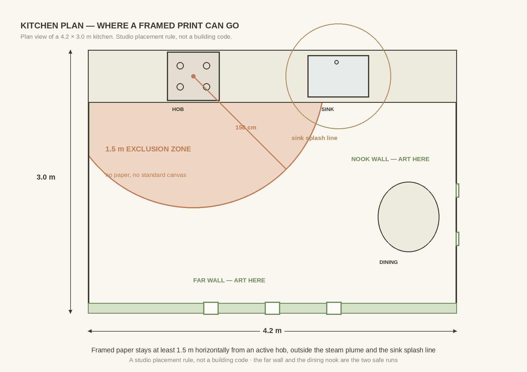
The Mediterranean kitchen page shows the pattern that results. The art sits on the far wall or the dining end, and the culinary species carry the connection to the room instead of proximity to the cooker.
Build the wall from what is actually cooked
A kitchen scheme should start with what gets cooked, grown, or recognised in the house. Filter the catalogue by real use rather than by the word “kitchen”, because every marketplace applies that label to anything green.

Fine-art print →
A Mediterranean kitchen has lemon, olive, artichoke, basil, fig, fennel, and tomato to work with. A northern or woodland kitchen has chanterelle, porcini, blackberry, juniper, and apple. Both lists describe a way of eating rather than a colour palette, which is why they still make sense five years later.
For a far-wall run I would combine Lemon, Olive Branch, Artichoke, and Sweet Basil. The forms move from fruit to branch, then to flower head and herb stem, so the run has rhythm without repeating a shape.
Keep it coherent without turning the room into menu signage. The test is whether the plates still read as botanical studies once the recipe books and the ceramics are taken away. The wider culinary palette sits on the Mediterranean Table page.
Where the art actually goes
The far wall

Fine-art print →
This is the main run, and it is the wall furthest from the cooking. On a 180 cm wall, three frames at 36 × 51 cm (14 × 20 in) with 10 cm gaps give 128 cm of art. That leaves 26 cm of bare wall at each end.
Set the centres on one line at about 145 cm when the wall is read standing. If the run sits above a bench or a sideboard, judge it against the furniture instead of the number. A fixed height above a 90 cm counter looks very different from the same height above nothing.
Paper belongs here. Glazing and closed backing handle routine room dust, and the distance handles everything else. No frame makes a kitchen inert, so leave air around the run and clean the wall as well as the glass.
The dining nook and the mushroom wall

Fine-art print →
The dining end is the safest wall in the room and the one people look at longest. It suits a tighter cluster and a closer viewing distance, so 22 × 30 cm (9 × 12 in) and more visible detail both work.
Chanterelle and porcini belong to a culinary story. Fly agaric does not. It should never sit in a group that implies otherwise. In a clearly naturalist arrangement it is fine; beside two edible species on a kitchen wall it is not.
Use common and Latin names on a card or in the house guide, and stop there. A decor caption is not the place for edibility notes or foraging advice. The room-specific arrangement is worked through in the mushroom kitchen wall guide.
The sunlit wall

Fine-art print →
A kitchen window can put direct sun on one wall for several hours a day. Light damage accumulates whether or not the room feels warm. It is also the slowest of the four failures. Nobody notices until a plate is replaced and the new one looks wrong beside it.
Check glare twice, at breakfast and again in late afternoon. A frame that vanishes at noon can mirror the window at dinner. Anti-reflective acrylic helps, and a blind helps more, but a different wall is usually the stronger answer.
Tiled and glossy surfaces make it worse by bouncing light back at the frame from below. Where a wall is both sunlit and tiled, put the durable subjects there and keep the delicate plates opposite.
Rentals and holiday kitchens

Fine-art print →
A private kitchen is watched by the person who chose the work. A short let is cleaned at speed by somebody who did not, which changes the specification more than the room ever does.
Keep frames beyond luggage, chair backs, and a standing child’s reach. Corners take the damage, so a wider mat is cheap insurance. Use acrylic rather than glass anywhere near seating. Two fixings on every frame, never a cord. A guest who finds a frame crooked will straighten it, and a frame that straightens easily also comes loose easily.
Check every frame during the deep turnover clean. Look for lifted backing before moisture gets in. Keep one spare in the commonest size, so a damaged plate never leaves a blank wall through a booking cycle.
Commercial and restaurant-adjacent kitchens

Fine-art print →
A commercial kitchen carries no standard art inside the working line at all. The extraction, the cleaning regime, and the fire and access rules make it the wrong environment, and the operator has to approve any fixing regardless.
Put the botanical scheme where the customer is: the dining room, the host area, the corridor to the WC. Those walls do the same job for the identity of the place and they can be specified properly.
Where a run crosses several rooms or needs a size no marketplace offers, the commercial project route keeps quantity, substrate, and permitted use in one written specification.
Kitchen art, canvas vs paper
Once the wall is settled, the kitchen art canvas vs paper question becomes answerable, and it stops being a debate about toughness.
Neither material is engineered for a kitchen, and neither claim you will read on a listing is testable from a photograph. Paper preserves the fine structure that makes a botanical plate credible, and the frame becomes the protective system around it. Canvas removes the glazing question and works at larger scale, and it gives up detail to do so.

Fine-art print →
The common belief is that canvas is the humid-room answer because it has no glass to fog. That is half right. It removes reflection and breakage, and it is genuinely easier to live with on a large wall at distance. It costs more than the smallest paper edition, and the print shop shows the current price for each size.
Canvas is still a printed textile. Grease settles into the weave, dust holds in it, and nothing about it is washable unless the producer states a method. A wipe that is safe on a frame can mark the printed surface permanently.
For a hard-working kitchen, framed paper on a safe wall is often the easier object to maintain, precisely because the glazing takes all the contact. Choose canvas for a broad silhouette at distance, not as protection from steam.
The Canadian Conservation Institute’s guidance on works of art on paper sets out why paper is vulnerable to light, high humidity, pollutants, and handling. A kitchen supplies all four in varying amounts, which is the argument for placement rather than the argument against paper.
The table below treats each wall as a separate exposure problem. One material rule cannot cover a hob wall, a dining nook, and a sunlit far wall at once.
| Kitchen zone | Format | Glazing or surface | Cleaning | Expected weakness |
|---|---|---|---|---|
| Far wall, over 1.5 m from the hob | Fine-art paper in a closed frame | Acrylic, anti-reflective where a window faces it | Dust, then clean the glazing by the approved method | Cumulative light and general room humidity |
| Dining nook | Paper cluster, or canvas at size | Acrylic for paper; matt surface for canvas | Routine dusting; inspect where chairs reach | Fingerprints, chair backs, food splashes |
| Sunlit wall | Paper, with a blind on the window | Ultraviolet-filtering acrylic | As above, plus a glare check morning and evening | Fading, and a mirrored window at dinner |
| Near the sink splash line | No standard paper or canvas | Not applicable | Move the art rather than clean it more often | Direct water and detergent aerosol |
| Above an active hob or kettle | Nothing standard | Not applicable | Use another wall | Heat, steam, grease, repeated wiping |
Backing matters as much as the front. A sealed or closed back keeps moist air out of the package, and it is the single specification most cheap frames skip. If a frame has an open card back with metal tabs, it belongs in a bedroom rather than a kitchen.
Clean the glazing, never the print. Apply any permitted liquid to the cloth rather than to the frame. Keep it away from the edge, where moisture travels into the package and lifts the backing.
A worked two-wall schedule
Take a hypothetical kitchen with one 180 cm far wall and one 100 cm nook wall. The far wall carries three prints at 36 × 51 cm (14 × 20 in). The nook carries a pair at 22 × 30 cm (9 × 12 in). At the entry paper price that sets a print-only floor for the five prints; specifying the far-wall three at the larger size raises it, before frames and shipping.
The print shop shows the exact amounts, along with framing and mat options.
One frame family, two sizes. That is what makes a spare worth keeping and a seasonal change quick. A spring artichoke becomes a summer tomato, or an autumn pumpkin, without a new hole in the wall.
| Route | Five placements | Your effort | Suits | Where to find it |
|---|---|---|---|---|
| Digital files, printed locally | See the Etsy store | Highest. You choose paper, crop, printer, and frames. | A first kitchen wall, or an unusual frame you already own | Etsy store → |
| Fine-art paper editions, framed locally | See the print shop | Medium. Prints arrive finished; a framer glazes. | Matching a moulding to existing joinery | View the collection → |
| Framed prints, ready to hang | See the print shop | Lowest. Measurement and fixing only. | Rentals, and anyone who wants it done once | View the collection → |
| Several kitchens, or a restaurant dining room | Quoted against the schedule | Highest specification, longest lead time. | Operators who need the scheme repeatable | Project route → |
The kitchen art canvas vs paper choice sits inside every one of those routes, not above them. A digital file can be printed on either. A finished edition can be ordered as either. The wall decides first, and the route decides only who does the work.
If you take the digital route, the digital printing guide covers paper weight, crop, and colour. Whichever route you choose, record the hob distance, the centre line, the mat opening, and the fixing type. Kitchen art fails slowly, through grime, lifted backing, and softened paper, and a short written record catches all three before the wall looks tired.
The plates: six subjects, six reasons
These six cover both kitchen registers, Mediterranean and woodland. Each one earns its place through the food rather than the colour.


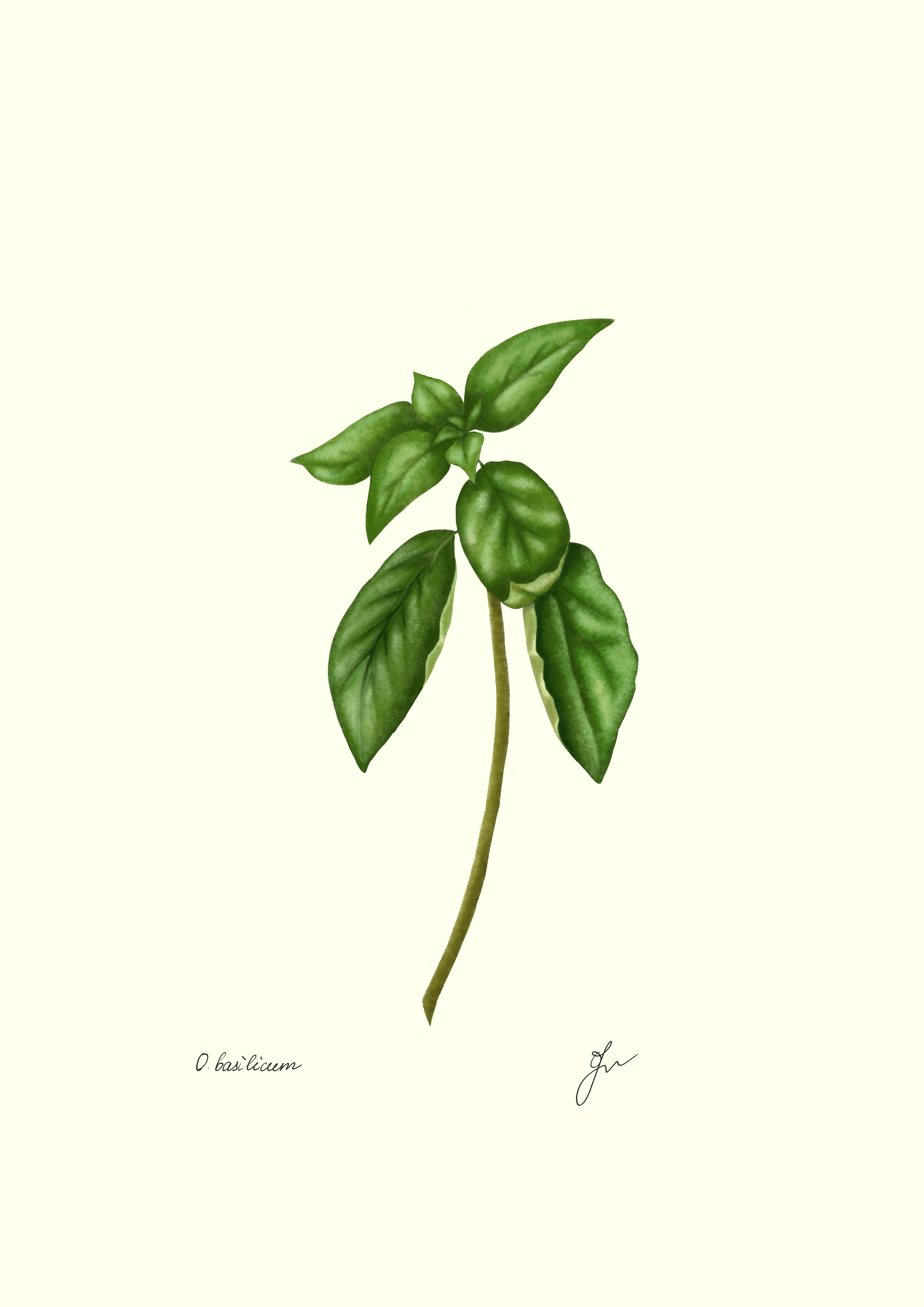


The full set
Building a culinary wall? See how the Mediterranean plates hang together.
Rotate the subject, keep the hardware
A seasonal change works when the frame size stays fixed. Store the removed editions flat, in a dry and stable place: not above the cupboards, not near the boiler, and never in a damp utility room.
Rotation is optional. A well-chosen lemon and olive wall can stay all year. Changing it because the calendar says so is how a coherent scheme turns into a drawer of orphaned prints. Change the subject when the room story benefits, not on a schedule.
A small card beside the wall does more than another jar of utensils. Four lines: the common name, the verified Latin name, and why the species belongs in this kitchen. A fourth line can say where it grows nearby. Writing one for every plate is the job nobody gets round to, so I have made them already.
Free download
Printable species cards for every plate in the catalogue.
Fifty-three labels, ten to an A4 sheet, free and with no sign-up. Each carries the common name, the verified Latin name, and a line on where the species grows. The back is left blank, for a house name, a recipe note, or nothing at all.
Keep the cards off the artwork itself. On a kitchen wall they collect grease and invite handling, and both are avoidable.
FAQ
Can I hang botanical art directly above a stove?
I would not put paper or standard canvas above an active hob. Heat, steam, grease, and repeated cleaning make it the highest-risk wall in the house. Use the far wall or the dining end instead.
Kitchen art, canvas vs paper: which lasts longer?
Neither wins on durability alone, because placement decides more than material. On a safe wall, framed paper is often easier to maintain, since the glazing takes all the contact and can be cleaned. Canvas removes glare and breakage but exposes a textured surface to grease.
Is canvas washable in a kitchen?
Not unless the producer states a method. Canvas is a printed textile, and a wipe that is safe on a frame can mark the printed surface permanently. Dry dusting is the safe default.
What sizes are available, and how is this botanical art printed and shipped?
The botanical.art print shop produces and ships archival fine-art giclée prints on paper or canvas, framed or unframed. Pages show three sizes: 22 × 30 cm (9 × 12 in), 36 × 51 cm (14 × 20 in), and 71 × 102 cm (28 × 40 in). Canvas and framed editions are also available, and the print shop shows the current price for each size. Five further paper sizes are available in the shop. Shipping options and timing appear at checkout.
What botanical subjects work best in a kitchen?
Species connected to the food and the place: lemon, olive, artichoke, basil, fig, fennel, chanterelle, or porcini. Keep non-edible fungi in a clearly naturalist grouping, and never imply that an illustrated mushroom is food.
Choose the wall before the format
The linked Mediterranean plates are available individually as fine-art paper editions, and the whole culinary palette sits on the botanical art prints pillar alongside the other rooms. Whichever route suits, the order of decisions is the same. Draw the exclusion zone, pick the wall, then choose paper or canvas for that exposure. A kitchen wall specified in that order survives the room it is in, which is more than most kitchen art manages.


